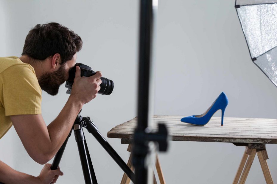
Small objects can quickly lose their shape if the background is competing for the viewer’s attention. A cup sitting on patterned cloth, a hand-made product on a crowded table, or a gloss-packaged item against a matching-colored backdrop might appear less distinct in a photograph than they do in person. In object photography, the background doesn’t only exist to set the scene: It can significantly impact whether the object’s silhouette, surface, corners, and overall detail can be seen clearly.
Start with a strong, yet subtle, contrast. A nearly black background may disappear if your object is dark-colored. A light-colored object may appear washed out or “unfinished” against a white background. One easy test for beginners is to shoot the same object photographed on a background that is lighter, a background that is darker, and a background that has a different texture. Take separate photos of the object on each background, and make absolutely sure not to move the object during this process. Compare the resulting photos, and then look first at the outline. The background that makes the object seem most distinct from the background may be the best background from which to continue.
It’s important to control the texture of your background as well. For example, a small product photographed on a blank paper background might seem too plain, or the background may distract from the object’s outline. Fabric, wood, stone, and matte card stock may make an object feel more grounded without overwhelming it. However, if you notice the background before you notice the object, you may need to switch to a background that is less textured or has a more consistent texture. A striped fabric, a glossy tabletop, a heavily-grained piece of wood, or even a heavily-scratched surface may not be a good choice.
Likewise, color will be one of your most important variables. An object may seem to disappear if the color you select for your background is similar to that of the object itself. It’s possible to photograph a beige object against a beige background if the lighting is strong enough to separate the edges with a defined shadow. In most cases, however, you’ll want to use a color that is related to but distinct from the object’s color. Think cream paper behind a white ceramic vase, soft gray paper behind a metal object, pale blue paper behind a handmade item, or natural-colored paper behind a natural-colored product. Remember that your background color shouldn’t overwhelm the photo. Your goal is to make your object easier to read.
Another element to think about as you select a background is the way you position it within the frame. A background that cuts off abruptly within the frame can leave you with a hard horizontal edge, a piece of tape, or a corner. Before you press your shutter, always check the edge of your photograph to make sure that you don’t see anything that distracts from the object. You may choose to pin down a piece of paper or piece of fabric behind your object to avoid a harsh horizontal line on a tabletop setup. Or, if you’re photographing from above, make sure that your background extends beyond the frame of your entire photo, especially where there are hard corners that might show the edge of a tabletop.
Consider the way that lighting will affect the background, too. An object may reflect off a background if that background is glossy and the light source is strong enough to create a highlight. A dark background will absorb light, making it look darker than it is. A white background may brighten shadow areas by reflecting light back onto the object. Experiment with moving the light source, and then look at the photograph that results: Did the background support the object’s shape, or did it seem to detract from the object? In general, a white card used as a reflector will minimize shadows, and a black card will make shadows more intense, making it easier to define edges of a light-colored object.
A well-considered background choice can help you avoid a number of problems down the line. It will help the object “pop” from the background, allow you to add props that won’t overpower the object, and may make other flaws easier to detect and remove before you finish shooting, including dust, glare, or a crooked object. Next time a shot seems too busy or dull, try making a few adjustments to the background: Don’t adjust the angle of your camera or change the light source; instead, keep all of your other elements the same while you switch to a new background. Compare the resulting photograph, and see if the object appears more distinct before you begin retouching. If it does, the background may be what you needed all along.